This post includes links to sponsored products
We all spend a lot of time in our bathrooms. I feel like cellphones have made that even worse—and yes, I’m referring to sitting on the toilet giggling at TikTok videos.
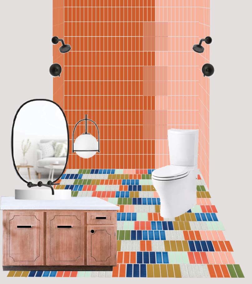
I wanted to create a truly unique space in my bathroom. It’s the first place I visit in the morning and it sets the tone for my day. So I decided to make it as hopeful and bold as I hope I live my day. Cheesy, sure, but it’s hard to have a bad day when you wake up to this.
Colorful Tile Bathroom Floor
I have been asked about the details of this bathroom so many times. The first thing that strikes people is the tiled floor.
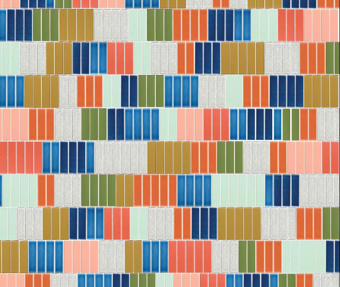
I had an idea to create a tile layout based on different groupings of color. I loved the idea of instead of working with 2 colors—I could create a brilliant array of colors that would compliment, contrast, and tease your eyes.
Picking Tile Colors
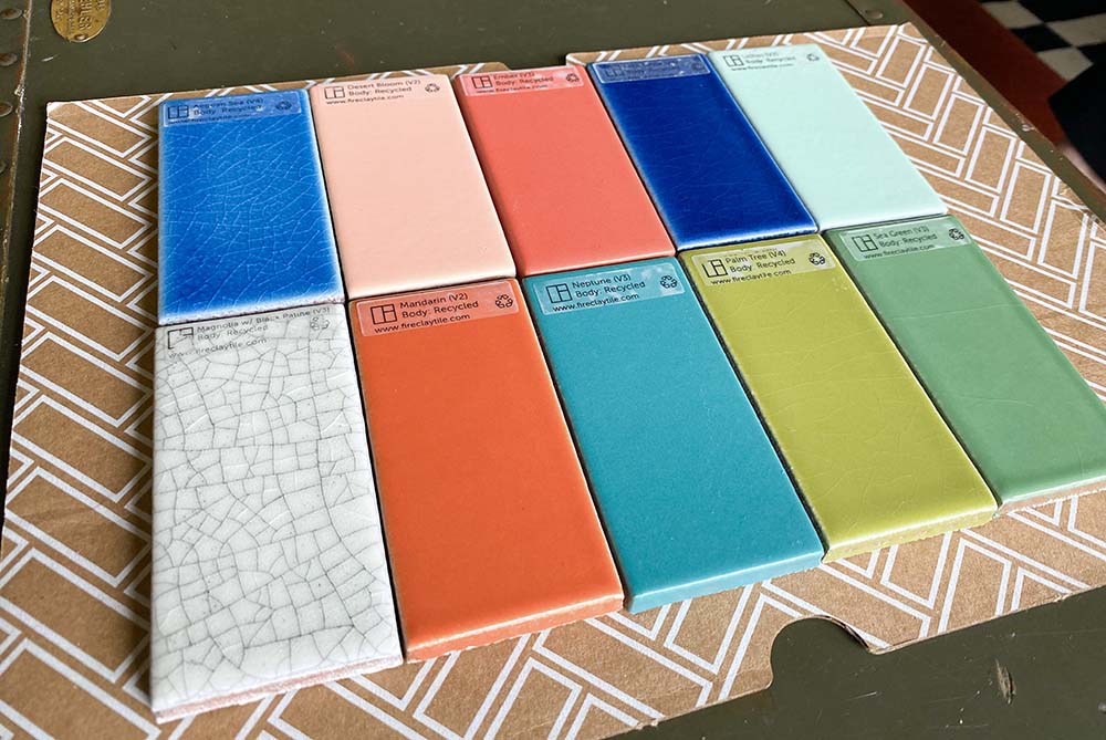
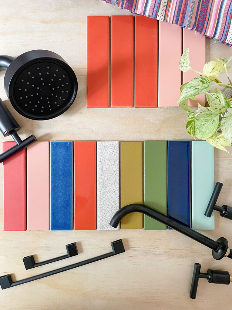
I had to get the right colors right so I ordered 12 different colored sample tiles from Fireclay. This way, I could see the color in person and play around with them.
For weeks, I looked like I was playing a very bizarre game of solitaire. I shuffled the tiles around, played with the tiles in different orders and patterns until I came up with the perfect color combo!
I narrowed it down to 9 colors. The colors I loved best together were:
- Desert Bloom
- Mandarin
- Ember
- Mustard Seed
- Aegean Sea
- Lake Tahoe
- Lichen
- Spruce Gloss
- Magnolia with Black Patine
They work so well together because many of them are similar in tone. Those that aren’t the same tone serve as a contrast so that it’s exciting to look at instead of flat.
Tile Design Plan
I’m not always the best planner. I frequently make phone calls and get to the voicemail and have no clue what I’m supposed to say. I have left voicemails that are 80% dead air or me humming awkwardly as I search for the right words. But for a project like this, I had to have a solid design plan.
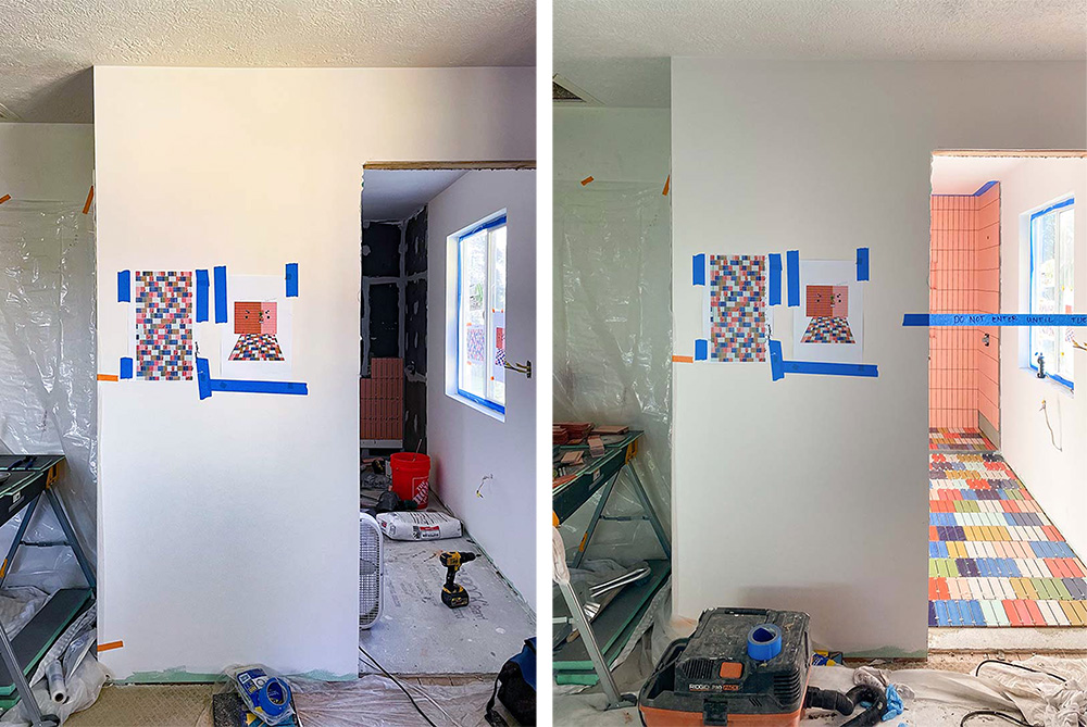
First, it was important to make sure I knew how much gorgeous tile to order. I started by going to Fireclay’s website and took screenshots of each of the chosen tiles. I then resized the photos to approximate my choice of 2×8 tile.
I pulled the screenshots into Adobe Illustrator and laid them on a to-scale mockup of the bathroom. I did feel like I was achieving a new level of Adobe expertise with this. Compliments are welcome.
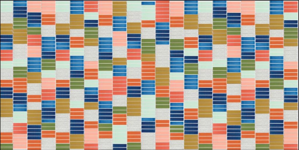
Designing this way made it easy to create a pattern. I could spend time making sure that each color played nicely together. I built out the pattern for the whole length of the room and played around until I had the final plan. Again, several hours of awkward solitaire but this time it was like that pre-loaded PC version but without that satisfying chimes when I got things right. You’ll notice that there are repeats of certain rows. This is for my sanity. I tried to break it up enough that it wasn’t super noticeable, and I think overall it was pulled off well.
Because I was ordering a variety of colors, this was essential to figure out the pattern and the color counts. Additionally, it’s easy to forget about things like ordering the correct amount and color of bullnose. Setting up a plan like this made sure I was set up for success.
Colorful Bathroom Tile Installation
Working with experts is the right way to go. When I was in Cambodia, I thought I could just walk around with my partner through Angkor Wat without a tour guide. Eventually, a guide convinced us to do it with him. It was the best decision I’ve ever made. I would have missed so many details, places of interest, the history, and wouldn’t have had the same experience.
I’m someone who will try to do everything myself. It’s not that I don’t believe in other people, it’s that I like the satisfaction of doing it myself. But with this gorgeous tile, I couldn’t afford to make any mistakes.
I put my stellar contractors on the project—and I’m so thankful I did.
Installation was a bit nerve wracking since I was going to be out of town during it (yikes!). Even though I trust my contractors, there are so many things you can do to make sure that they have all the details. They want to be successful with the project as well, so in my experience, it helps to take some extra time with them. I explained in detail:
- How I wanted the tile to line up
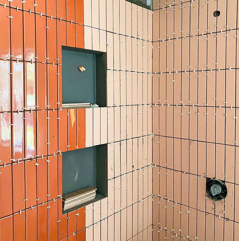
- Where I wanted the shower niches to be
- I printed off several 11×17 color mockups (you can do this at fedex or kinkos) of the tile flooring
- I also printed several images of the shower walls
This gave my contractor exact instructions for the pattern and design for laying the tile. He was incredibly accommodating and asked a lot of questions to make sure it would turn out right.
Abel, if you ever see this, wow. You nailed it.
Black Hardware Finishes
With all the bright tile throughout the space, I wanted to make sure there was enough white space and then black graphic notes. Black helps provide a great contrast with bright colors and keep it playful. I love it because it really lets the colors be as bold as they want to be whereas silver, brass, or copper fixtures can get lost.
So for this bathroom, I chose gorgeous matte black hardware and fixtures from Build.com. With the warm wood vanity, I think the black truly helps ground the space. They stand out in the space, but they emphasize the gorgeous tile. I love these modern fixtures from Kohler’s Purist line as well—something more ornate would have felt like it was trying to steal the show. These fixtures are firm and strong with their bold modern shapes and lines.
Here’s a link to the wall-mounted faucet and shower head and trim that we chose.
I sourced all of these from Build with Ferguson. They are a huge online home improvement marketplace with so many brands, styles and products. You can get everything from a fridge to a bathroom mirror here. They offer consultations for free–in person, online, or over the phone. I’ve talked the ears off of some very generous employees at our Portland store.
I chose white porcelain for the sink and the toilet. I’m obsessed with them both. The toilet is this delightful new style that simplifies the silhouette. I never realized how busy most standard toilets look until I got this one.
The black, white, and wood choices in this bathroom really operate to cut the richness and saturation of the tile. They work as some much-needed white space in the room, bringing freshness and giving your eyes a place to rest.
I’m using the oval mirror which I had leftover from another project and the curves of the pendant light to balance all the angles and lines of this space. I think the shower fixtures and the sink shape help to balance that as well.
Stay tuned for a full before and after post soon!