This post was sponsored by City Home. All thoughts and opinions about how wonderful they are entirely my own.
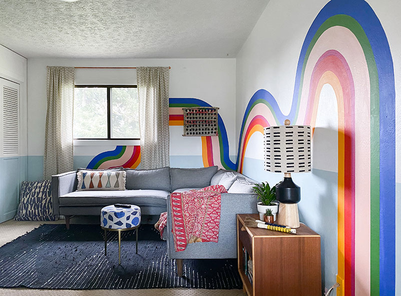
Welcome to our recently refreshed and revitalized media room! A quick history on this room—it used to be a bedroom when we moved into this old 1950’s house. I couldn’t stand the floor plan, so I cut a big hole in the wall and made a hallway. What was left over was this cozy little nook that we’ve been using as our TV/media/video game/binge-watch happy place. It was here that I binged Game of Thrones twice in a 6-month period. I know. Sacred.
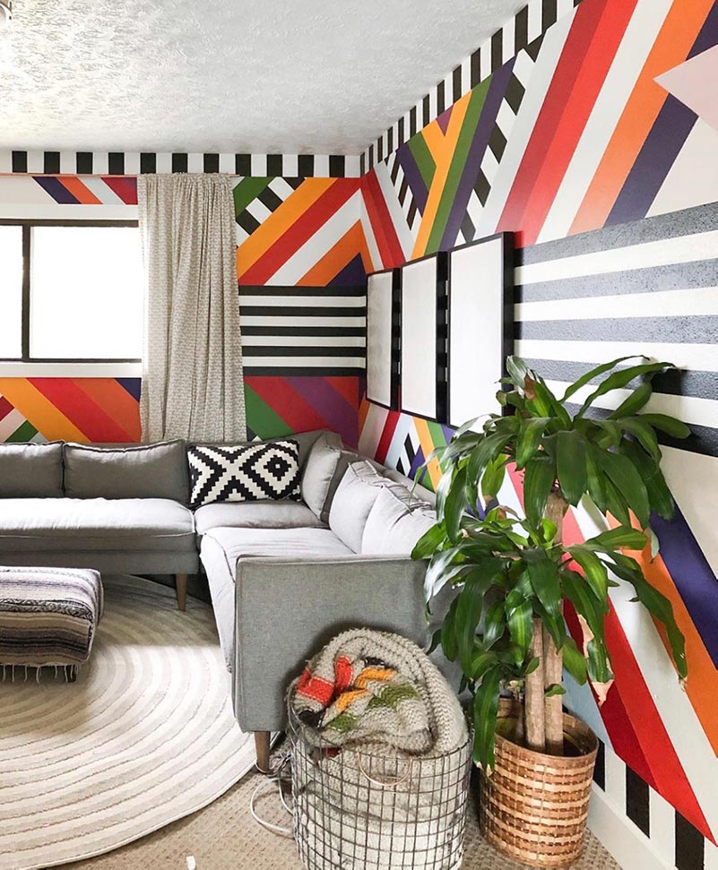
It’s also been home to one of my most known and shared murals in my home. You know, the one with the star and the crazy, fun bold stripes? It was my first big mural and when I say big, I mean I had to stop ½ through and cry. It took over 60 hours to do so deciding to replace it… was a big deal for me.
But I believe in the power of art. When the art doesn’t speak to you anymore, you need to find something new that will speak to you.
Converting Shiplap Walls Into Smooth-Textured Walls
Did I mention that this house was a mess when we moved in? Because of all the changes to the wall structure, I thought it’d be easier to install shiplap in this room then to drywall them. The shiplap went up pretty easily, but over time, it became an eyesore to me. I’m not opposed to shiplap when it’s appropriate to the house and region, but this felt disjointed.
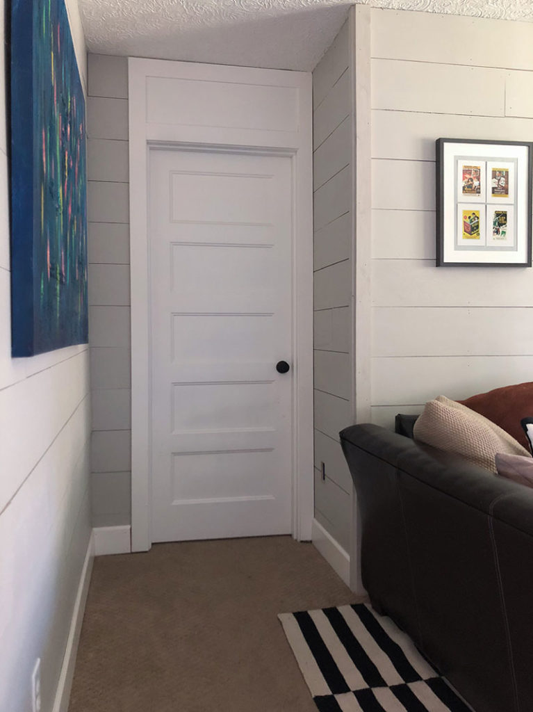
I got joint compound, a putty knife, and mesh tape. First, I laid the mesh tape over every seam and then applied joint compound over it. After a couple passes, I’d use the putty knife to smooth out the textures so it looked fairly consistent. After it dried, I used 100 grit sandpaper to sand down the walls.
I expected this to work, but I didn’t expect it to work as well as it did. The walls are beautiful and smooth now and you’d never know that there was shiplap underneath. Ideally, one would remove the shiplap and just do straight drywall, but in this case, I had installed all of the trim on top of the terrible faux shiplap. In order to do that, I’d have to tear out all of my trim. Not happening. Not ever.
So glad this worked.
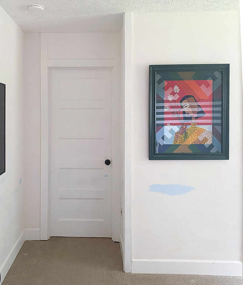
Sanding down your beautiful mural
I may not have cried about this, but it hurt a bit. Every time you paint over a mural a part of you dies. Thus, creating a horcrux within the paint. Make sure to carefully dispose of the paint dust using any of your favorite charms/spells.
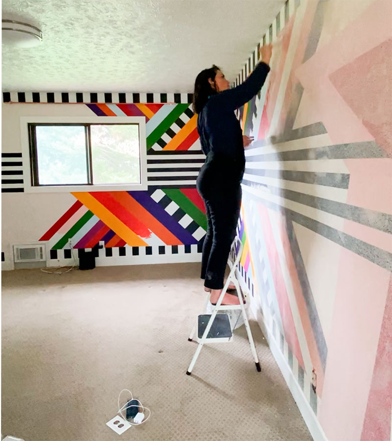
When you use my clean line trick, it creates a ridge in the paint. For a mural like this, there were many, many ridges because of all the lines I had made. Five minutes into sanding down one of these ridges, I decided to skim coat the wall with a joint compound. This was a cheater’s way out, but I suggest it if you can for murals that have many lines. See my stories for a tutorial on how to sand down smaller murals with fewer ridges.
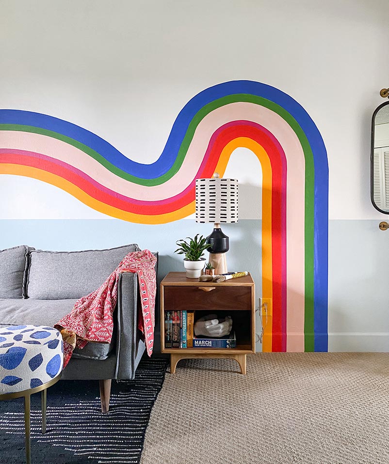
Hippy-Dippy Swooshie Line Mural
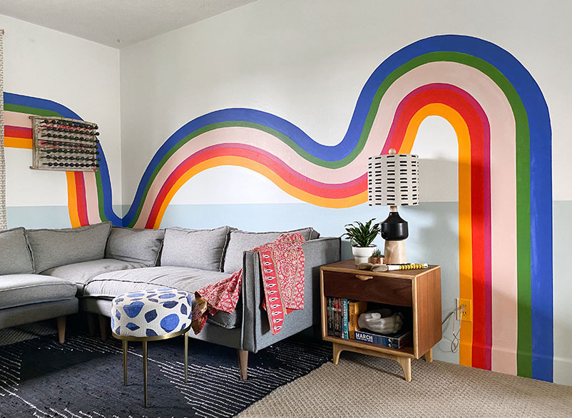
I didn’t think of a name before writing this. It’s fine. I don’t often give my murals names, it’s mostly about a feeling or shape I want to see. In this case, I wanted looser, freehand, less exact curves that would feel playful and more organic in contrast to its more geometric predecessor.
Because we are staying at home (COVID-19 blues), I raided my paint cache of hundreds of tiny sample pots from Home Depot. I was so prepared for this. My husband will never question my sample pot obsession again. Victory.
I had limited color choices, but I had all the swatches. After playing with the colors I had available for a bit, I arrived at something that felt really fun. These colors are (clock-wise from the yellow): Blazing Bonfire, New Age Blue, Diva Glam, Top Tomato, Belfast and Prairie Rose. These are all Behr Paint colors.
After I painted the first coat, I recognized two problems with the mural.
First, I realized that my curves were too consistent in height. Because I wanted something more organic, I had to go back and drop one of my curves down lower to help create some asymmetry and flow to the design. #FlatteningTheCurve

Second, the colors weren’t right! I mean, they were, but the yellow was dominating the conversation and talking over everyone else as if they were the only ones who had a good idea. Ugh. So, I had a heart-to-heart with the yellow and helped guide it to a better place. By increasing the width of the red and swapping places with the purple, the palette became more equitable and more visually appealing. I have video documentation of all of this in my instagram profile highlights. Come along for the ride!
Voila! I have a mural!
City Home AKA The Cave of Wonders
One thing missing in our previous iteration of this room was depth. We had a couch, an ottoman, a rug, an old nightstand, and a designer chair that was slowly being ripped apart by one of my kids who is now grounded for life. He’s three.
When you are forming a room, it’s easy to have it start looking like a catalog if you buy everything at once or from one store. I don’t know about you, but I don’t get excited about things that feel like they are one-note or just borrowed from a template that someone built for them.
That’s what is so incredible about City Home! They are a local home furnishing store that has locations in Vancouver, Portland, and Lake Oswego and I couldn’t have a bigger crush on them if I tried. Don’t tell my husband.
This store is the most thoughtfully eclectic place you will ever go into. Those two words are important. It can be easy to be “eclectic” but if not done thoughtfully, will just seem disjointed. City Home sources and sells the most incredible collection of furniture, lighting, decor, art, dishes, and anything you could need. They have everything from new pieces to vintage. Walking into their store immediately feels inspiring taking you across many different aesthetics. You can find farmhouse, industrial, mid-century, boho, and traditional pieces married together—sometimes in unexpected ways. That’s why I consider it a cave of wonders. You don’t know what you’re going to find and you’ll always be pleasantly surprised by what you do find.
Clearly, I could go on. Instead, I’m just going to tell you about what I found for this room.
Color-Blocked Doorway Decor
This painting from Sew Trill is primarily the inspiration for this room. I loved the color-blocking on it and that color blue. But with such a beautiful piece in the room, I wanted to make sure the decor I used accentuated it without distracting from it.
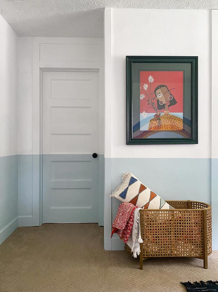
I found this basket at City Home while I was shopping and knew immediately it belonged in this spot. The size and scale of it is perfect for storing blankets, pillows, and all of our unsightly comfort objects. It’s subtle enough to add so much visual interest without using up much space. We’ve had a number of baskets in this room and this is the first that has added something to the room instead of being just a practical solution.
The pillow I also found at City Home. It’s a cute throw pillow. I love the color-blocked detail on it.
Viewing Area
We like to keep big oversized pillows for added seating on the ground. We have three kids and we are lucky if they make it through a movie, let alone sit in the same place. These big, beautiful pillows are lovely for them as they move around the room watching a show with us. Then I can lean them back up and the room looks stunning.
This ottoman. The cutest ottoman you’ve ever seen? That one. Love it. It decided the blue for the room. Thank it and City Home for their hard work.
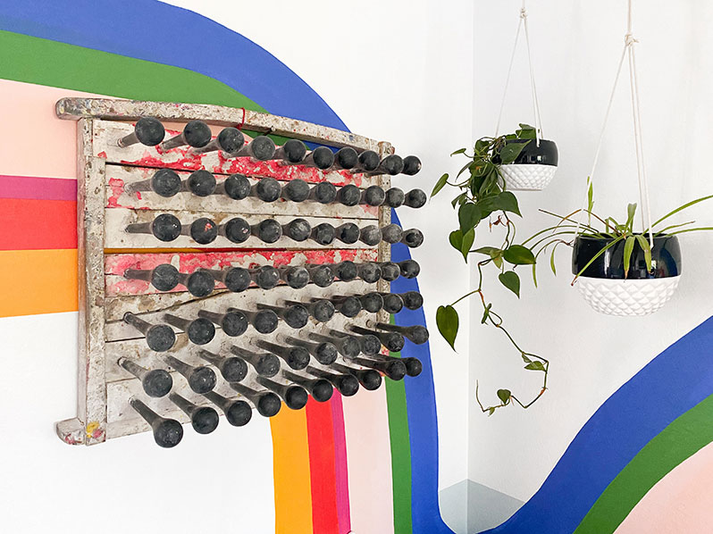
What’s that? Oh, you mean the most fascinating and visually delicious thing I’ve found in years?! Why, that is my vintage balloon mold that I found at City Home. I know, it’s the most random thing. While I was walking through the store with my husband, he was suddenly fixated on it—and then we both were. It was the first thing we decided to bring home with us. There are even latex remnants from old balloons on it. It’s one-of-a-kind—technically, maybe not, but it’s something you aren’t going to find anywhere else. This is the thoughtful eclectic expertise that City Home has. They can find a piece like this and know.
Entry & End Table
I am not a tchotchke person. I do not like clutter. I do not like small, pointless objects that I know are just going to end up creating a mess. My art is usually on my walls—painted directly on—so I don’t have the clutter of frames. I couldn’t say no to all of these pieces at City Home because they are amazing!
These stone paint brushes—are you kidding me?! Stop it already. You’re gorgeous. For someone as obsessive about paint brushes as I am, these my favorites, and they don’t even work for my murals! I love their colors and their smooth handles. I may have even brushed my face with them over forty times. It’s been a long month indoors.
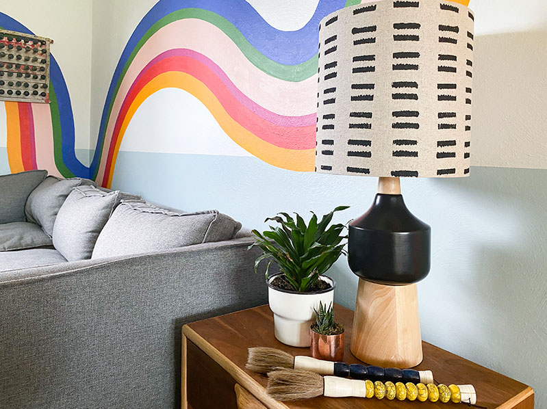
This lamp (the details!), this kantha throw, the cupped concrete hand figure and swivel mirror are all from City Home. I am in love.
A Love Letter to City Home
Hi City Home, it’s me, Racheal.
Do you like me:
Yes
No
Please circle one.
But really, I love this store. They are my favorite local store for home decor. Right now, it’s important to support the things you love, particularly your local crushes. Their shops are currently closed to customers BUT there are many ways you can still get your hands on one-of-a-kind pieces and support such incredible people.
These guys have an incredible inventory and they share it daily on their robust Instagram account. I love that they post tutorials in their stories, design advice, and share unique decor that you won’t find anywhere else. And I’ve got to say, their prices are great. I’m often someone who will brave the second-hand stores for weeks to find one treasure. After finding City Home, I realize how much time I’ve wasted. I will never get that time back, but you can! Save yourself by buying from a company that curates an incredible collection. Until then, you’ll find me just walking around the treasure trove that is their store.
During April 2020, they are offering free local delivery on purchases over $50. They have a Free Shipping collection with items that ship in the continental US for free- They also offer virtual design consults while we are all in social isolation!
Go follow them and get inspired on the daily!


That ottoman is too good! Love how you make everything look so custom
Looks amazing! What color is the light blue on the bottom half?