
Make Your Own Mural
It happens all the time that people will reach out to me to tell me how much they love my colorful home and murals, while in the same breath telling me that their walls are all white. I always laugh and tell them that mine are too! White walls are the BEST foundation for any color you want to add. I like it most when color is a surprise POP!
I love to share ideas for murals that people can paint in their homes. will always share my color palettes, but I don’t create custom palettes for people (yet). Below is my process for creating your own palette! To illustrate this process, I partnered up with Curator Paints to share some of their gorgeous colors with you.
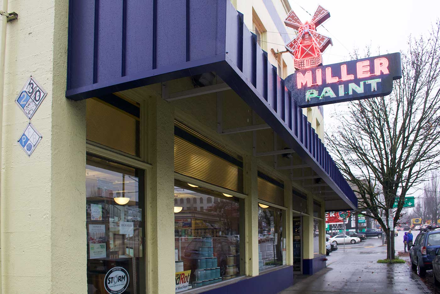
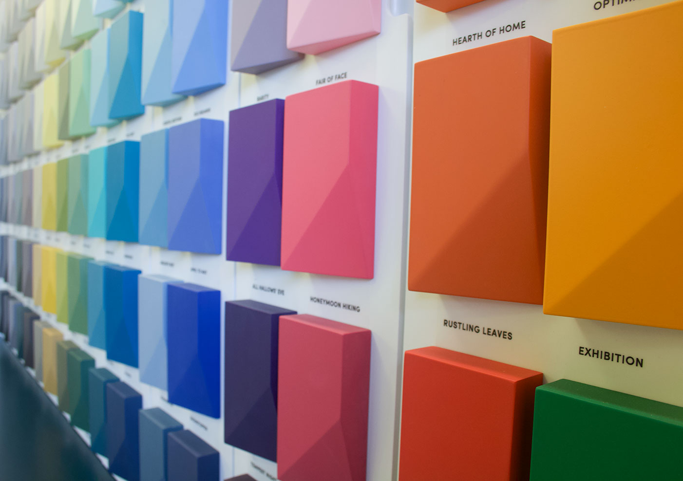
Curator is a boutique brand out of Ireland that has recently made its debut in the United States. Here in Portland it’s stocked in the Miller Paint Store on Grand Ave.
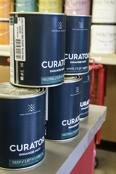
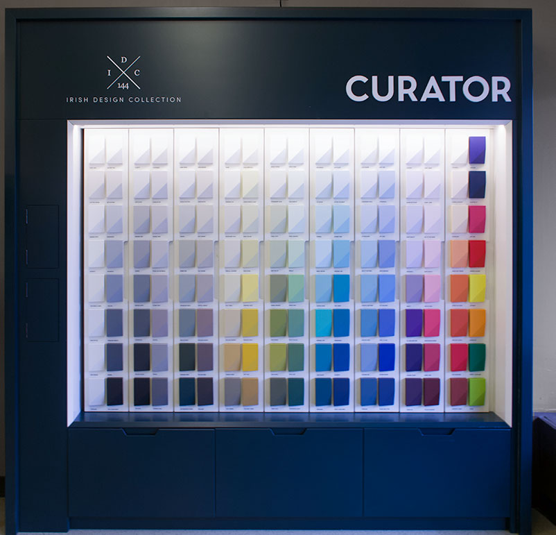
Curator has 144 colors, each inspired by the home country of Ireland and the art created there. Unlike larger paint stores, they have a curated collection of paint colors to make your color choosing process easier. Instead of debating between 8 different emerald green colors, they have one (Saints and Scholars), and you know it will be gorgeous. The paint goes on smoothly and beautifully. I’m in love.
Let’s Create a Color Palette!
First Things First: Start With One
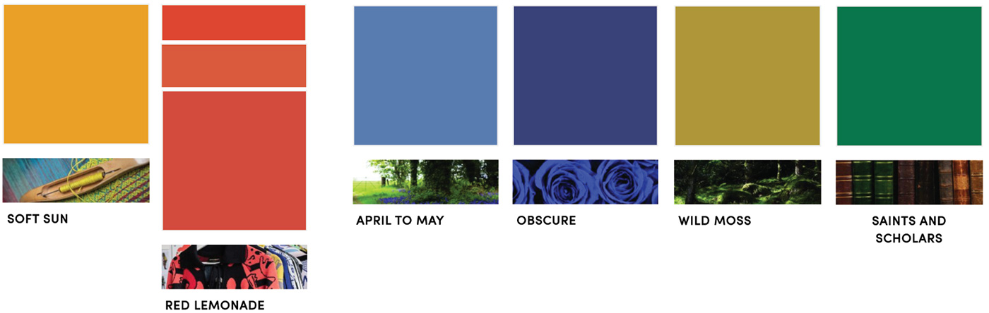
When you’re looking at a wall of color swatches, it’s so easy to get overwhelmed. In a sea of color, where do you even start? Start with one! I find one color that I find interesting. This time the color I started with was Soft Sun. I chose it when I was designing my last mural and decided in the end that it didn’t belong with the other colors, so I wanted to use it here.
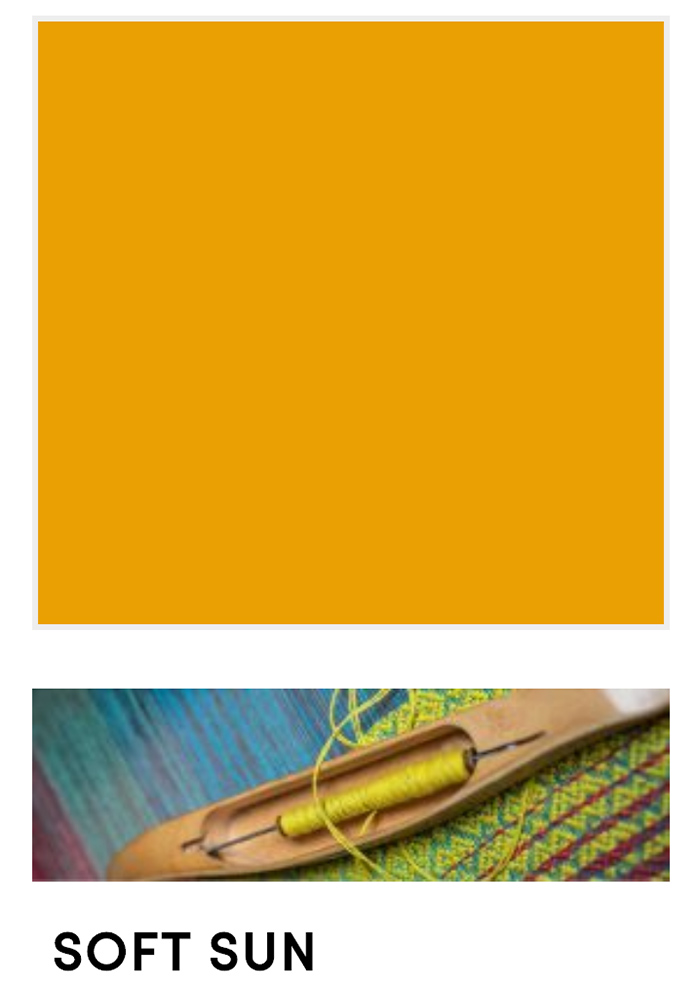
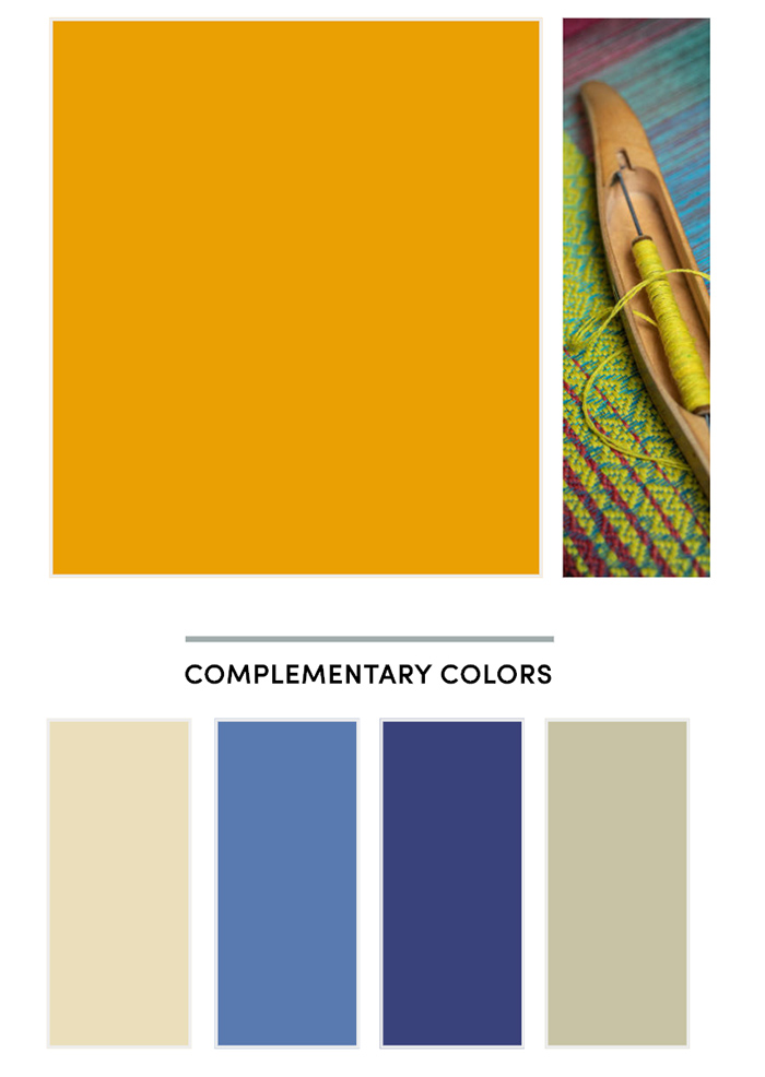
I’m including above a screenshot from the Soft Sun color swatch page. There’s an area with complementary colors. Most color swatches have information like this. That’s a handy little cheat sheet that you can keep in your backpocket. We don’t need that though. Here’s my next step:
Find Your Next Color
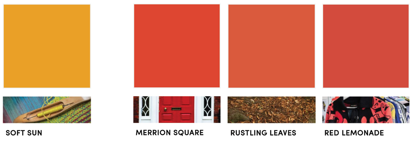
Was that a stupid rule? Lol. But really, just pick another one that you like! In my case I know that I’m drawn to orangey-reds, so I found a couple reds that I thought could work: Merrion Square and Red Lemonade. I also brought in the similar orange Rustling Leaves in case that worked too.
Add Opposite Tones
Whenever I’m creating a color palettes I add in at least one color that has an opposite tone to help balance it out. Let me explain. The colors we have here are warmer colors (more yellow tones), so to balance them we would add in colors with cooler (blue) tones. This helps the palette feel balanced and prevents our eyes from getting too overwhelmed. I pulled a bunch of cooler colors that I liked, and added them to my board.
I did all of this digitally, taking small screenshots of each color (using the tool command+shift+4 for a screengrab). I then created a board in Adobe Illustrator to play around with all of the screenshots to see how they felt together.
This image is all of the colors I’ve pulled so far.
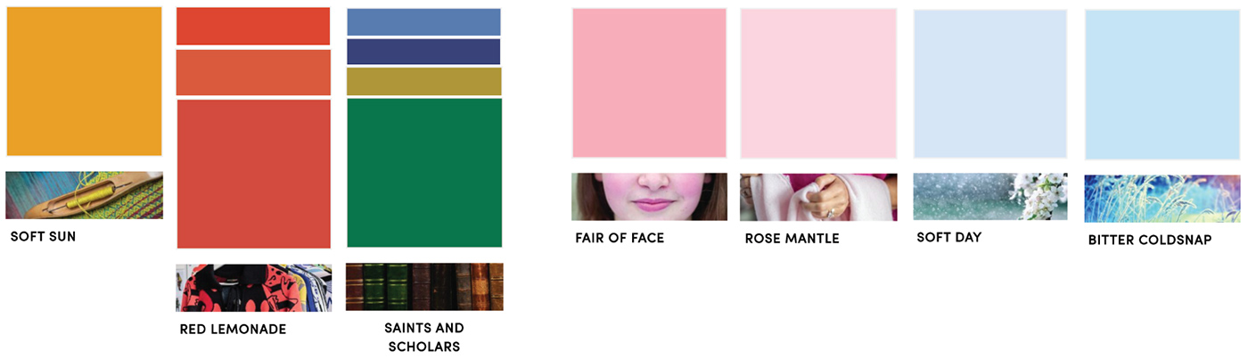
Add in Your Visual Breaks
When you’re combining a bunch of colors together, I think it’s important to give your eyes a place to rest. With the number of intense colors we have here it can be a little overwhelming. By adding in some pastel colors. My favorite colored “neutrals” are pink and blue.
Play With It!!
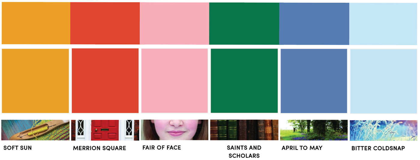
Alright. Now things get messy. Rearrange all the colors! Play with it! Change the sizes! When I did this I split it up into two different color palettes, sets of 6 colors.
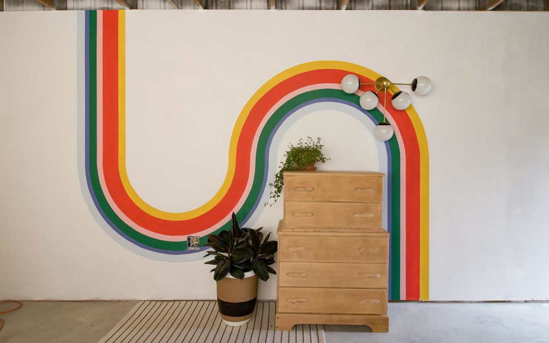
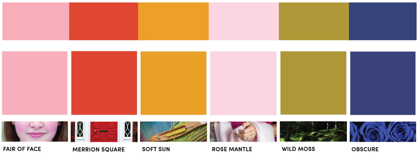
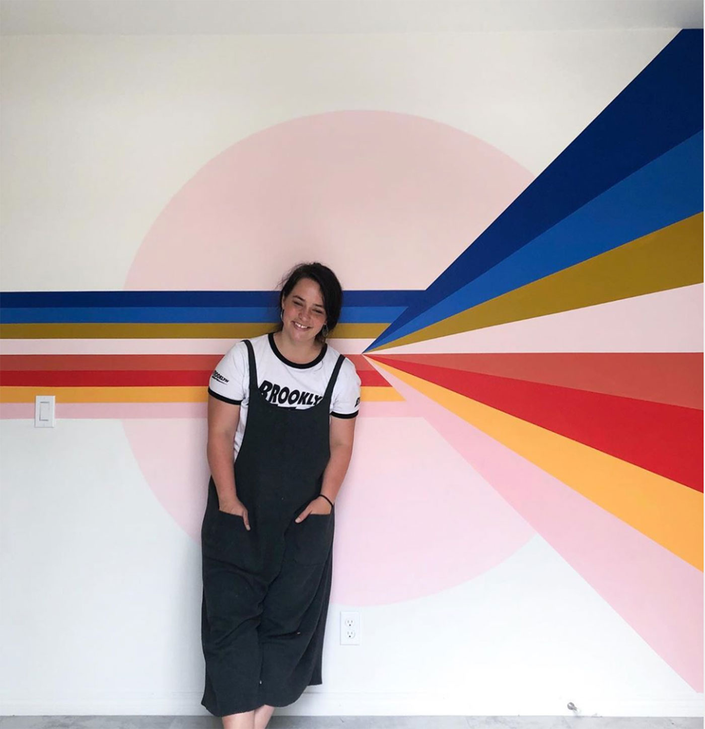
This first color palette is the design that I went with for my current mural.
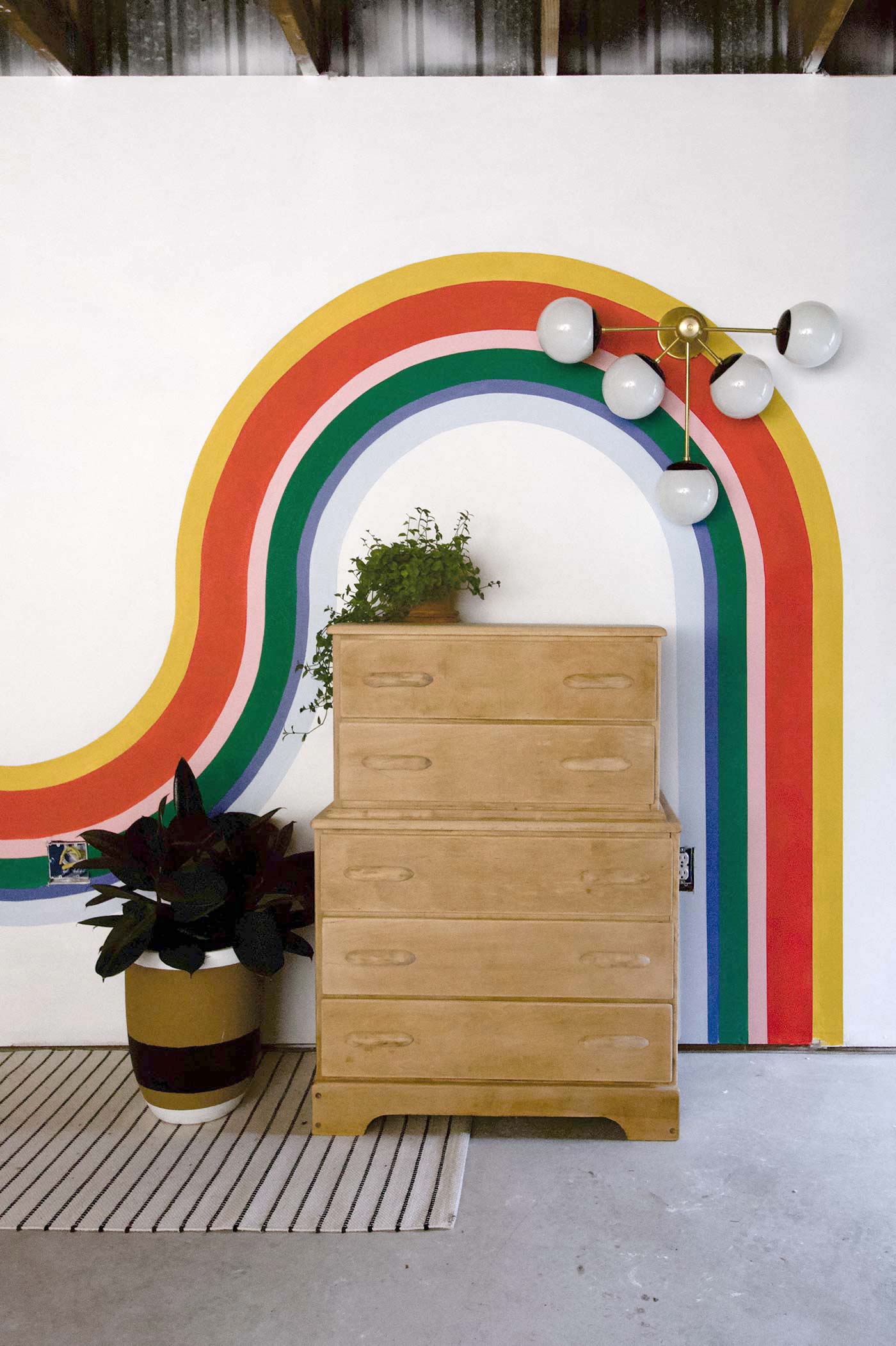
I used colors similar to this set in a previous mural.
Ok, now tell me what you think. Did this help? Do you have more tips to add? Let me know! lets refine this process together.

Such a good mural! I also like looking through a magazine or on Pinterest for rooms that inspire me and pull out colors from there to go off of. Then I can recreate the feeling of the space I saw
So lovely and inspiring! How do you get the curved lines so perfect? Tape seems like it would be difficult to use on curvy designs. How do you do it?
Where is the light fixture from?
It’s from sazeracstitches.com!
Thank you – you do great work!
Great content! Super high-quality! Keep it up! 🙂