
This post has been sponsored by Spoonflower. Opinions are mine!
Do you remember my old bedroom? It had a cool paint job and headboard, but it never fully felt like me. It felt heavy, and dark, and frankly a little boring. I just felt like it needed to change. I need color!!! BOLD color. And pattern. And did I mention color?
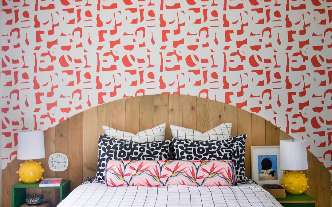
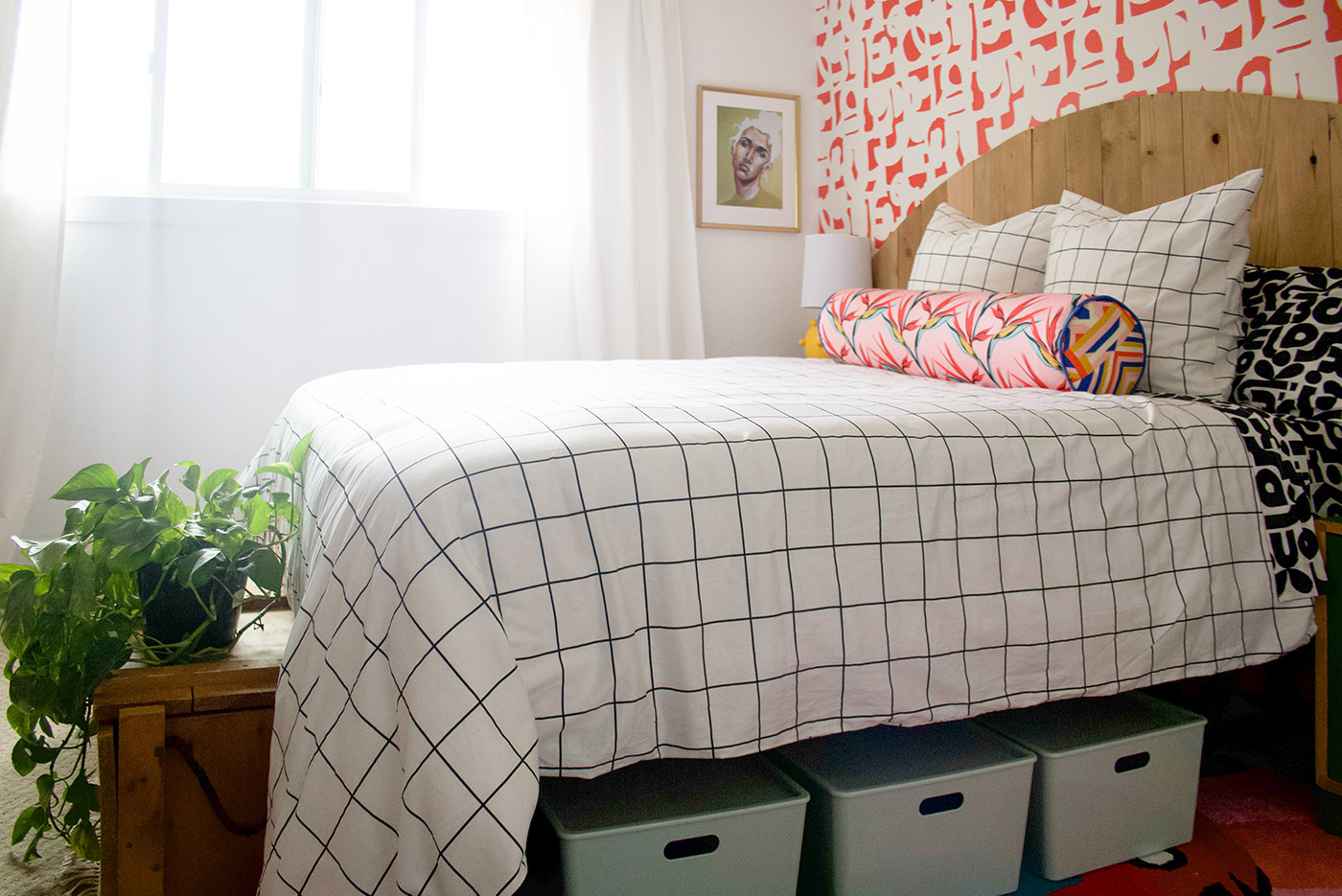
OK, first off, HOW RAD DOES THIS LOOK?? I’m so excited about all the shapes and texture and pattern! It is bold and interesting and it reflects my personality so much more. Because Spoonflower has over 750,000 patterns (all by independent artists, which I LOVE), you can easily find something that fits your aesthetic. So I went with bold and geometric.
How to Mix Patterns
The patterns you mix need to be different. There are a lot of ways to do this, but this is how I made it work here.
Shape
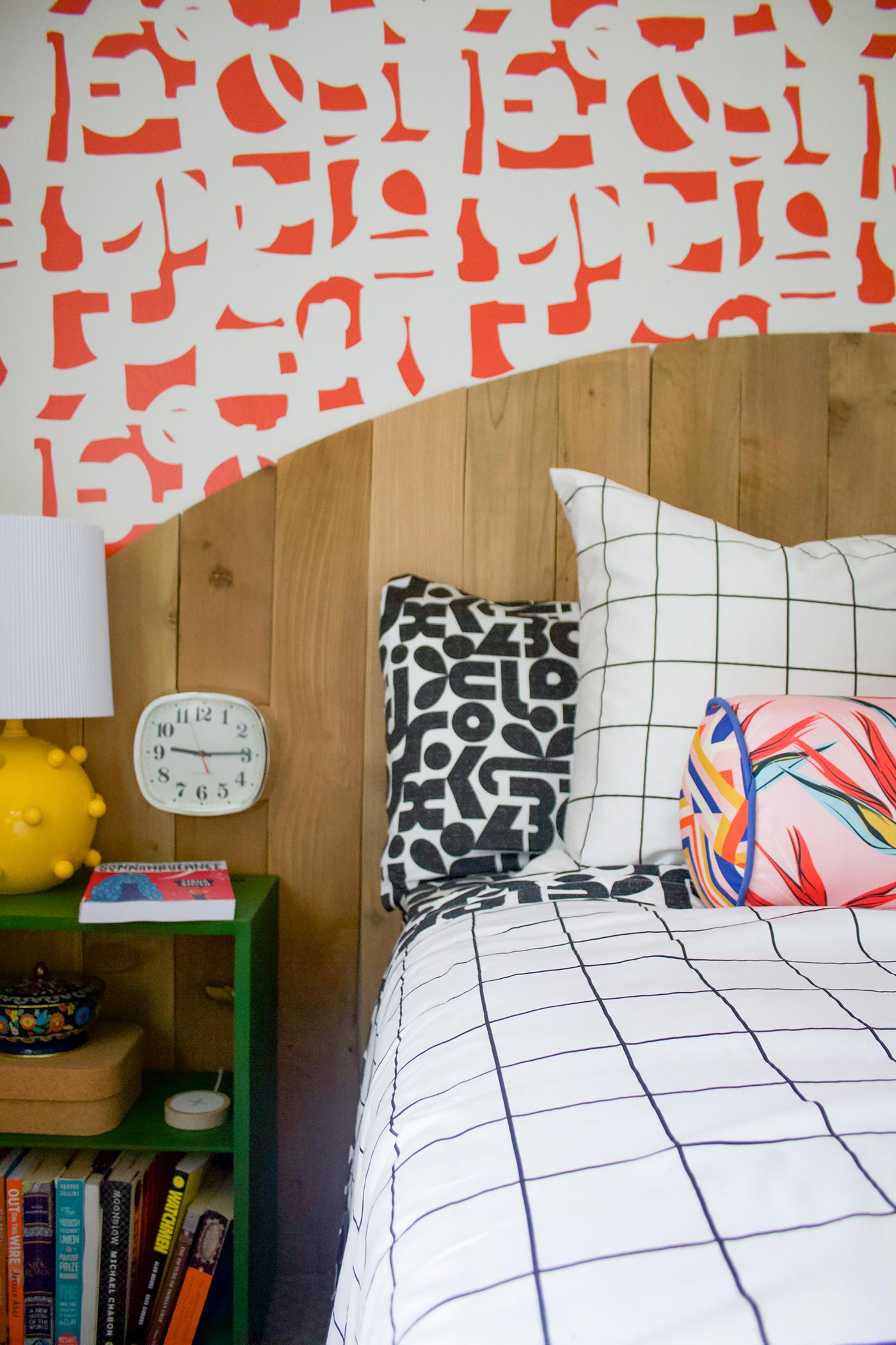
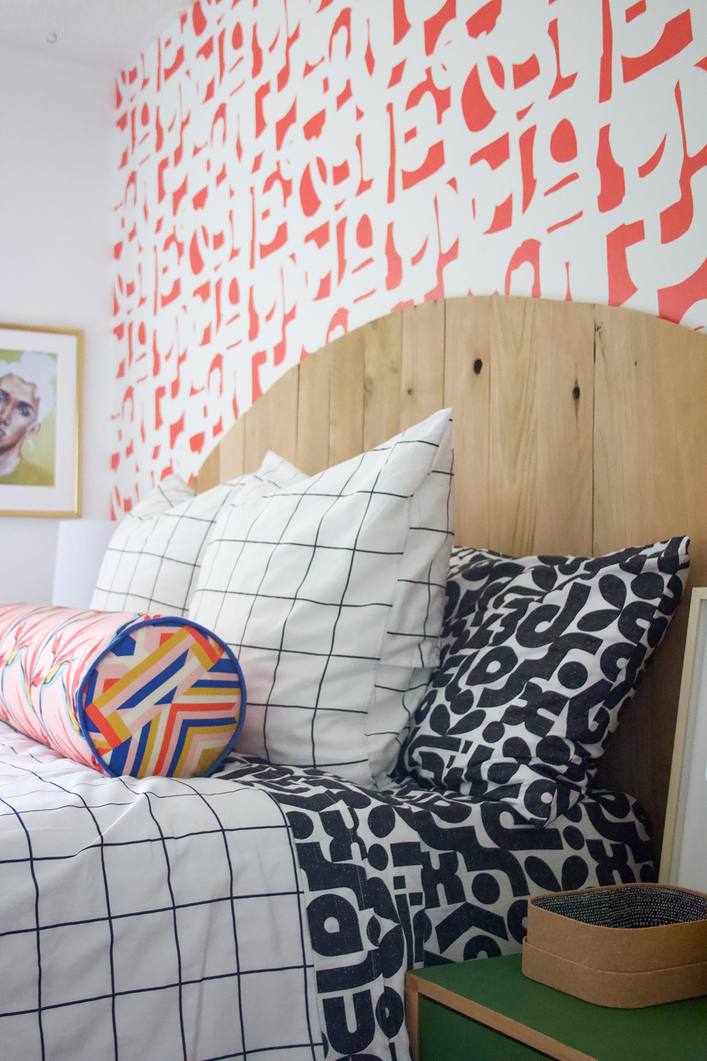
- Structured (Grid)
- Geometric (B&W Block print)
- Organic (Bird of paradise fabric, squiggly wallpaper)
Color
- Black and white (feels clean and crisp)
- Colored Background (Bird of Paradise print–this gives a visual break from the contrast of the black and white)
- Color Tie in: The wallpaper red is the same red in the bird of paradise fabric. The original design was in a light pink, but I reached out to the designer on the Spoonflower website and she was able to change the color to match! You can also ask them to change the scale of the pattern as well.
Scale
Honestly, I didn’t really nail this principle here. I didn’t order swatches first on all of my materials (rookie mistake!), but if I had I would have probably scaled down the sheet print a bit. It still looks pretty fantastic, so I’m happy!
n this specific case there is A LOT going on, and normally think it would be too busy. The trick is to include visual breaks to keep it from being overwhelming:
How To Create a Visual Break
- I used a clean and simple pattern for the dominant print—the black and white grid feels simple, and because the lines are straight and clean the look feels clean
- I have a visual break between all the patterns going on in the bedding and the pattern of the wallpaper. The wood boards behind the bed give your eyes a place to rest between all the chaos of the patterns.
- Solid colors, like the nightstands and lamps
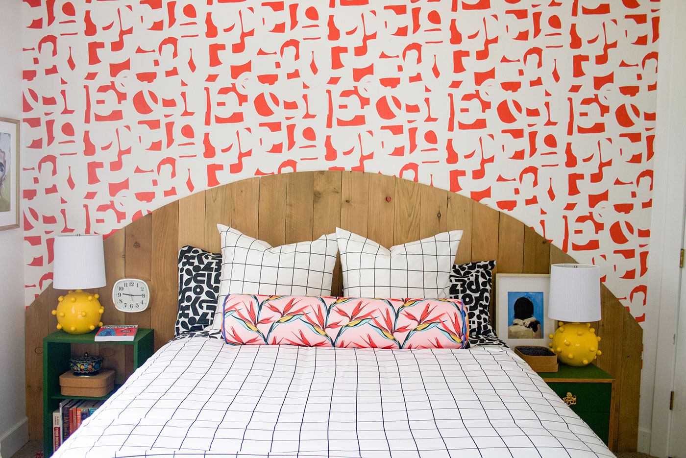
One last trick I want to share is about colors and creating a layered, eclectic feel. I like to make sure there are a couple colors that don’t quite go. If you look at the colors in the bird of paradise fabric, you’ll see an ochre color (yellowish). I could have painted my lamps that yellow, but instead I used a brighter yellow that didn’t really jive with it. Because these yellows clash a little bit it adds interest to the room. Same with the green in the nightstands.
Thoughtfully create your space and then throw in something unexpected. Keep people on their toes.
.
Source Details
I KNOW you want to know the specifics on these textiles. So here ya go! If you just want to browse Spoonflower’s bedding options, explore here.Duvet
This duvet cover is 100% cotton sateen, and has a hidden zipper at the bottom (and I am trying to figure out why NO ONE ELSE DOES THIS! Buttons always show, the zipper is so discrete. It also has little ties on the inside of each corner to keep your comforter in place. The design is also printed on the front and back. $189 each! I picked this one.Sheets
Also cotton sateen, and are DEEP. I have a pretty thick mattress with a foam topper, and the 14″ sheet depth covers it well. Mine are these ones.Knife-Edge Pillow Shams
Lol. I know that’s what they’re actually called, but I still think its funny. These are printed front and back and have an envelope closure. Find mine here.Round Lumbar Pillow
I found this bird of paradise fabric that I loved, and knew it needed to be a pillow. I already had an ugly lumbar pillow that I thrifted and had been sitting in my garage for a year, so I decided to recover that. I ordered one yard of fabric in the eco canvas and I think it turned out really well (and I hear its washer-friendly!).Wallpaper
I chose the water activated smooth wallpaper. Like I said before, this wasn’t a color that was offered, but after reaching out to designer Louise Margaret, she was able to color match it to the flowers in the bird of paradise print. I have orange peel texture on my walls and you can see the texture through the paper (such is the struggle with ugly textured walls), but I don’t mind! I hear that if it really bothers you, you can go over the walls with joint compound to smooth them out. I didn’t because I don’t care, and I’m just a tiny bit lazy.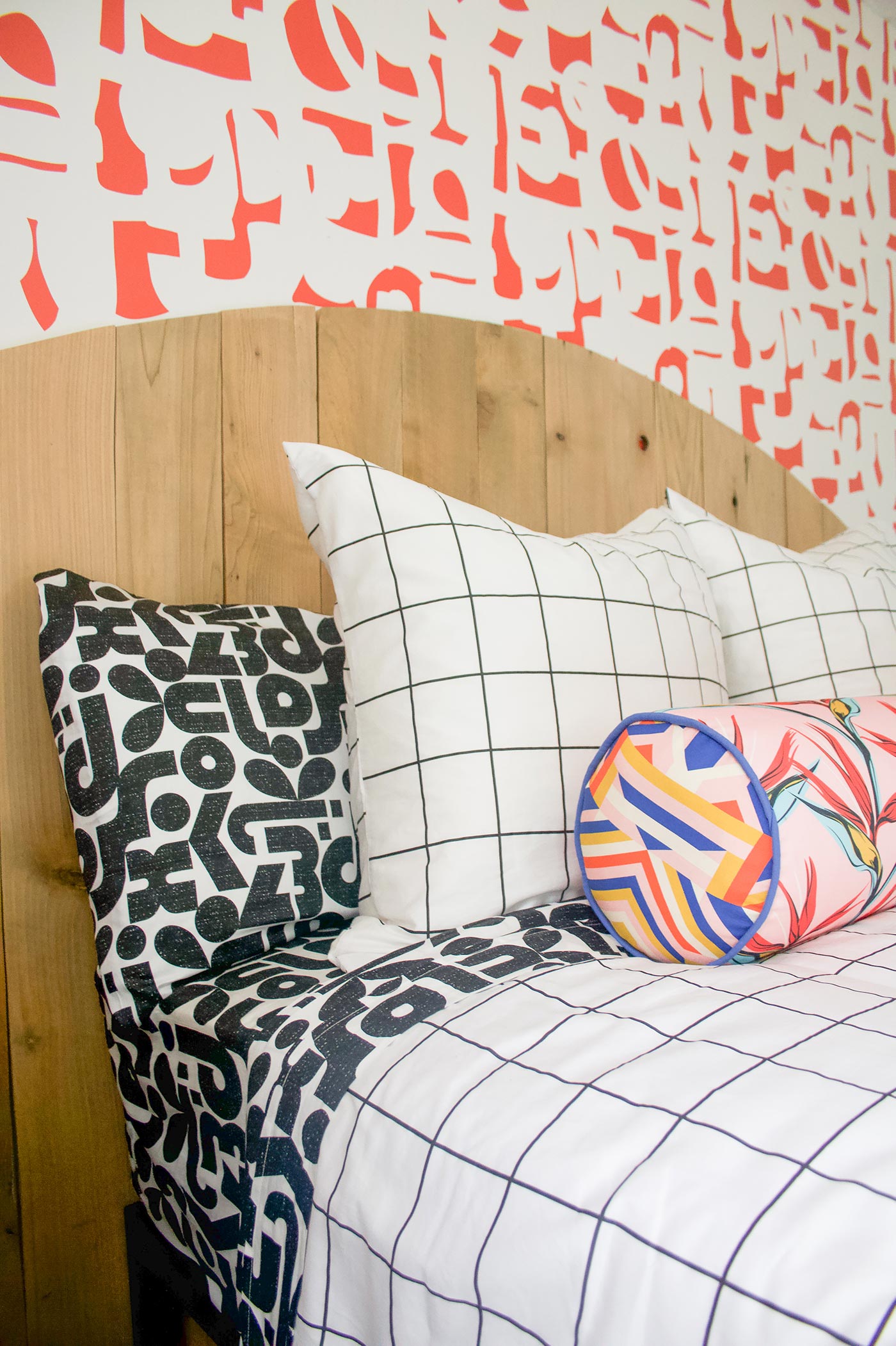
Did I cover it all? Do you have more questions? Do you love it/hate it/can’t live without it?

Thanks for sharing your formula for mixing patterns! I like how the wallpaper and pillows/sheets reflect each other. I like how you pull everything together with all the color details.
It turned out so amazing!!!!!
You knocked it out of the park sister!!
Your pattern play game is on fire!!!! I did not see this coming!!!!
So fun! IS this actually a headboard or pieces of cut/mounted wood? If so, do you have any tips on making it?
Hey Alaina! It is actually just a bunch of boards nailed to the wall. I was initially going to build it into a solid piece but this ended up working better. I laid them all out and used the string, pencil, thumbtack trick to draw the curve on, and then cut along the line with a jigsaw!