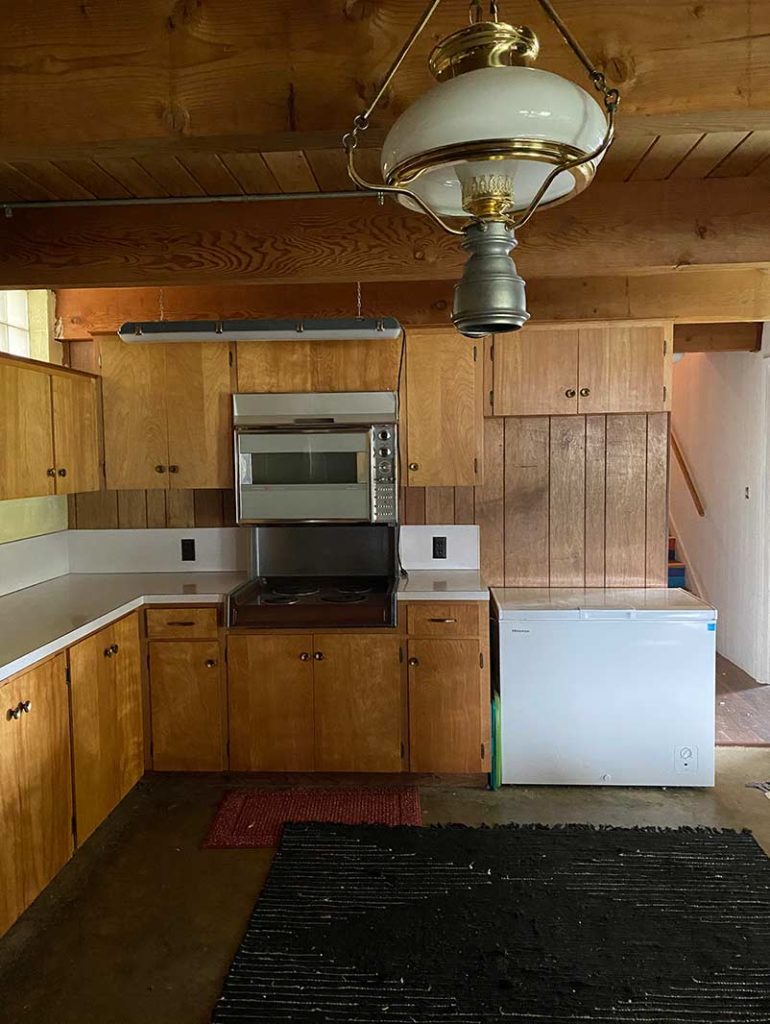
My family says our home feels alive. When we first moved in after renovating, we had agreeable gray walls. Everywhere. Yes, can you believe I did that? I quickly added some design elements to bring in some color, but it still felt lifeless.
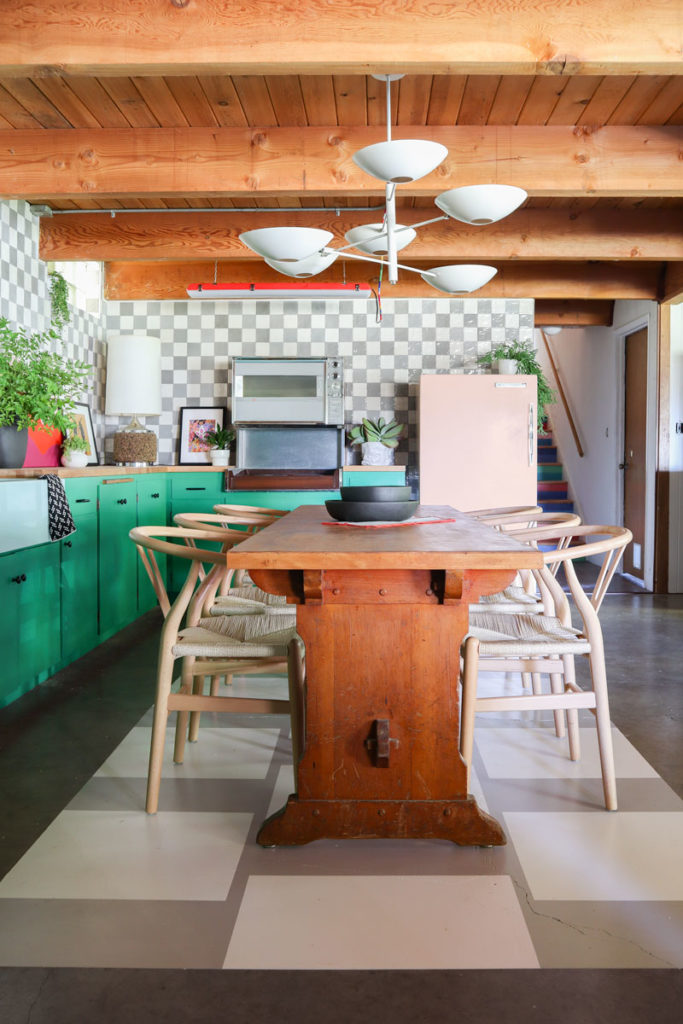
Years later, with paint, color, and risk-taking, our home feels as vivid and bold as the people who live here. When we moved into this basement at the beginning of the year, it was a reminder of how far we’ve come. Our upstairs had all this personality and the downstairs—was lost. It was completely devoid of feeling and soul.
I’m so excited to show you how far we’ve come.
Before & After
Tile
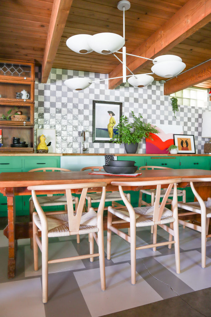
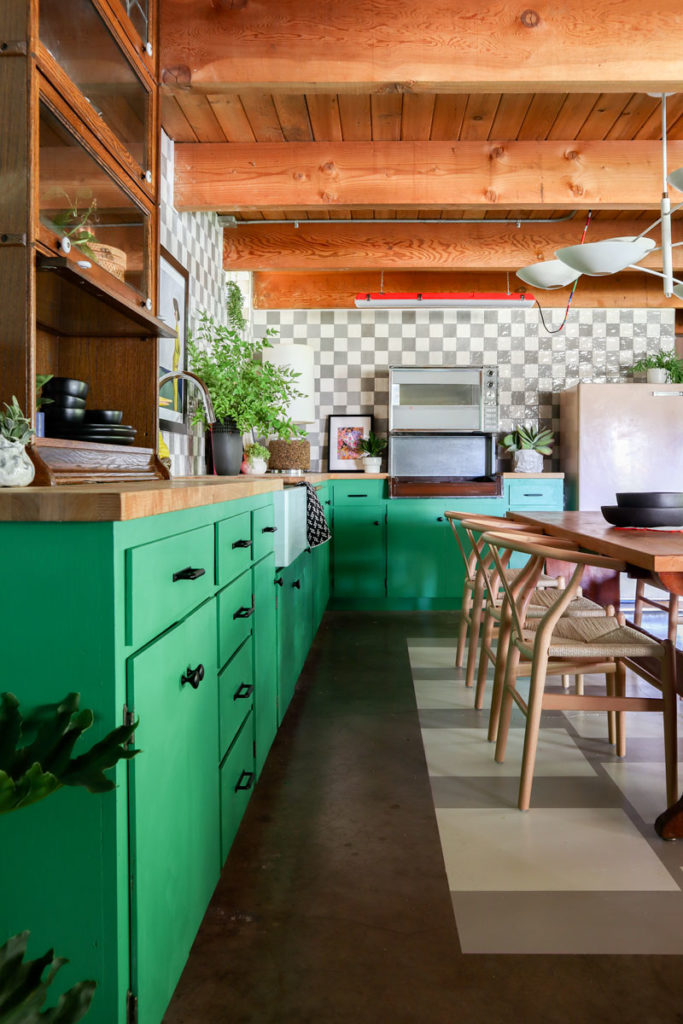
I partnered with The Tile Shop for my massive backsplash in my kitchen. I couldn’t have asked for a better sponsor because they helped me make my dream version of this space. Initially, when I first talked with them, I was debating between their lovely white or gray tiles. I finally ended on the gray tile. When I got it, I was blown away with the slight variation in the color that added so much interest to it. But the more I looked at the space, I realized that I needed to add more white to brighten it up and balance it all.
I reached back out with a new design concept and landed on this delightful checkerboard design of gray and white tile. The Tile Shop got it to me quickly and were so supportive of this shift in direction.
Installation
I didn’t feel like mixing stuff for the tile project, so instead, I bought some premixed mastic adhesive. It made everything go very quickly. I applied the mastic to the wall and then to the tiles—pressing them into place. This went fast. For a second, I thought I may have slipped into another dimension or plane where time flows differently because in less than a full day, I had the entire kitchen tiled. Am I some sort of god, demi-god, heroine with unique powers? Possibly. Haven’t had my like catalyst event yet to like fully reveal the depths of my powers. I’ll keep you posted.
Grout
For the grout, I chose a gray. I applied the grout to the tile, using the float to evenly coat the cracks and make sure that I wasn’t leaving any gaps behind. Garrett followed behind me with a large sponge and a bucket of water, mopping off the extra grout and filling any gaps I may have missed. This part of the process was longer than I expected, so in the end, the whole thing took about as much time as I had planned. After we had covered the whole wall, Garrett went back over it with a cloth to wipe away any grout haze that was still left on the tile.
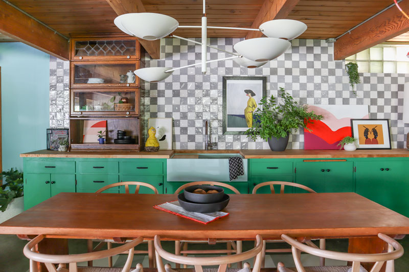
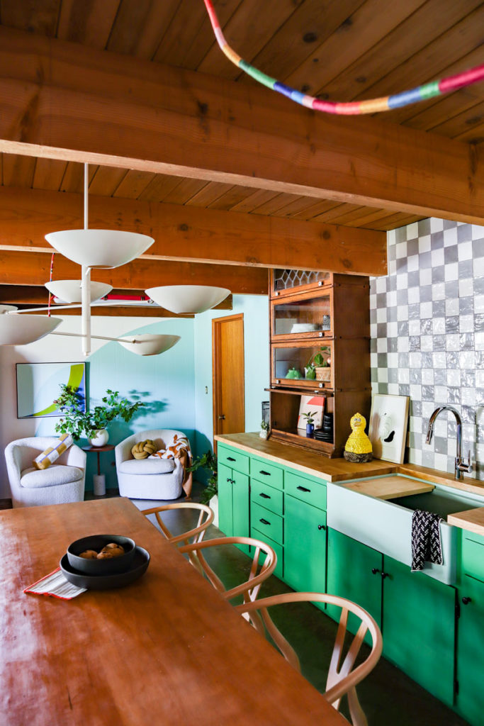
I’m so deeply in love with this backsplash. It’s playful and adds so much life to a kitchen that could have felt a little too mature for my taste. This keeps the kitchen fresh and adds new life to the antique appliances and furniture in the space.
One of my followers pointed out that the tile looks like the default transparency background for PNGs in Photoshop and I couldn’t love that more. I have been looking at that a lot lately so it must have worked its way into my subconscious. But as some other follower suggested (and whom I totally agree with), it represents the ongoing nature of change, improvement, design, and evolution that my home is always in. See how profound that is? Thanks followers for getting philosophical for me.
Trim
To add some extra polish, I went around the edges with some trim. I painted two sides of the trim white and then used a finish nailer to get it up into place. I then went around and caulked the trim and tile so that it is all sealed up nicely.
Confession, I don’t always… do this step. I have been known at times to skip some of these polish steps because I assume I’ll come back to it. Can you guess how often I come back to finish these type of things? Never. Furthest thought from my mind. I never want to have to go back and revisit a space like that especially for details. If I come back to a space, it’s to overhaul, paint a new mural, or make a big splash. Detail work—bah!
But I will say this, it looks so good because of the trim. I guess, I’ll have to change my ways. Next year. Or the year after. We’ll see if I have time to change my ways.
Table
We want this space to be a new home for our larger dinners and get-togethers. Which is why we need a beautiful table, like the one from Pan’s Labyrinth except without the pale man. <shiver>
I had already stripped down the table and it was ready for stain. Before I got started, I bought like 5-6 types of potential stain for the table. I found a piece of wood that was similar to the table and used it as my sample surface.
I cannot stress enough how important this is. Speed date all your stain before you apply it to your actual surface. Why? Because you may find out they hate rom-coms in the first 5 minutes of the date. Or disclose they are the administrator for a conspiracy theory website. Or you’d look over and they wouldn’t be wearing seatbelts.
On paper, the two stains I was most excited about turned out to be too dark and heavy for the table. Then the Walnut stain I got out of a hunch ended up being exactly what I needed. Just like my husband—it’s the ones that you don’t expect that are the real winners. He wears a seatbelt, loves rom-coms, and only watches the recent UFO news somewhat closely. The whole package.
The Walnut stain was beautifully warm. It almost feels like an amber glow in this space. I think going any darker would have added back some of the shadows that we’ve been working so hard to cast out of this basement space. Begone, evil spirits!
We applied the stain to the table in two coats. I don’t usually use a brush for stain. I use a cloth and dip it in the stain. Remember to go along with the grain as you apply. I love using cloths because I can manage any pooled up stain quicker than with a brush. Don’t let the stain linger in pools or hard lines or they’ll likely stick. I usually apply the stain liberally, smooth it out so it’s even, let it sit briefly, then run back over it with a separate cloth to pick up any extra stain.
After an hour, I applied the second coat. It looks amazing! I’m really enjoying looking at the wood surface now, because I promise you, very soon it will be covered in pans and plates of delicious, scrumptious food. I will never see it again.
Chairs
We lifted the table onto the floor painted rug. I’ve been dying to do this last part. About a month ago, I got these incredible chairs from Apt2B. I unboxed them pretty quickly and just longingly pet them as I walk by because without the table, the chairs are lonely. I slid the chairs up to the table and now I’m obsessed.
They simple, thin and tapered shapes, but are incredibly sturdy and strong. Sometimes, I feel like you have to compromise between really heavy duty chairs with blockier design or narrow beautiful lines that are a little bit more precarious in build. These chairs couldn’t be better or more comfortable. The backs are gorgeous and still leave enough of an opening to see the table when at eye-level. They add a lot of visual interest to the space and are very inviting to sit in. Obsessed. Simply and truly.

Faucet
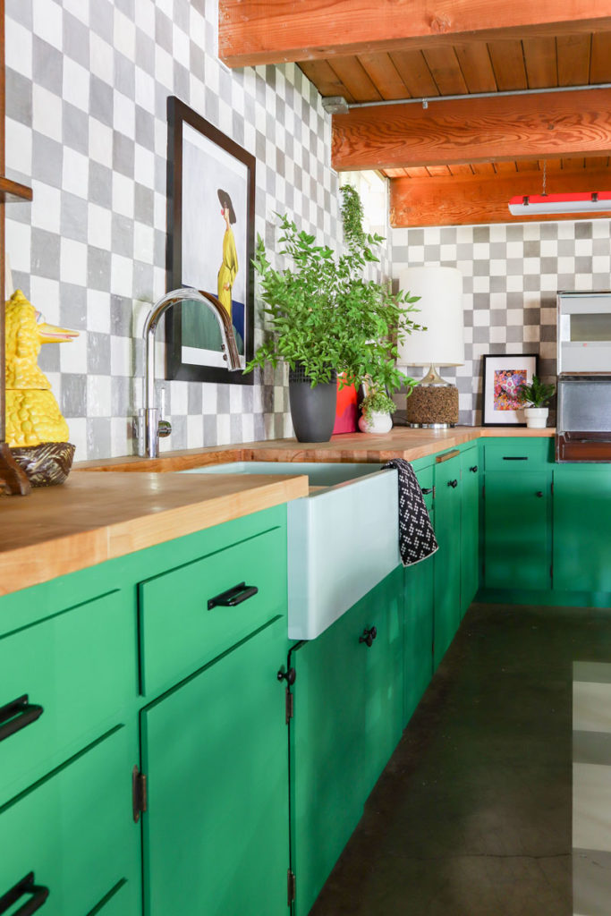
The faucet I have in mind for this space didn’t arrive in time for the One Room Challenge, so instead, I had to install this one I got from Amazon. It’s great, but nothing to write home about.
Spoilers—but I will be installing the new Hansgrohe faucet in the next few weeks. This faucet has such clean lines and the polished nickel is stunning. When I designed this kitchen, the Hansgrohe faucet and the Elkay sink were like the celebrity couple of the space. It won’t feel fully finished without the super handsome hardware next to my gorgeous sink. Until then, give this faucet some grace as it’s doing it’s best.
Lighting
Remember how I keep talking about how terrible the lighting is down here in this basement? One of the keys to changing that was to get an eye-catching chandelier into the space. With the table in the center , it was perfect for a lower-hanging centerpiece light fixture.
I partnered with Blueprint Lighting. I bought their little color palette kit when I was trying to figure out what would work in the space. They had so many fun, bold colors to choose from. My kids and I played with them like they were trading cards trying to pick the right color. But in the end, I had to go with white. With the green cabinets and the mint green sink, I didn’t want to overload the eyes with too much color. I wanted the art on the wall to add some accent and pops of color. But I wanted the light fixture to be clean and attractive.
Now that it’s installed, I look at it and just gasp.
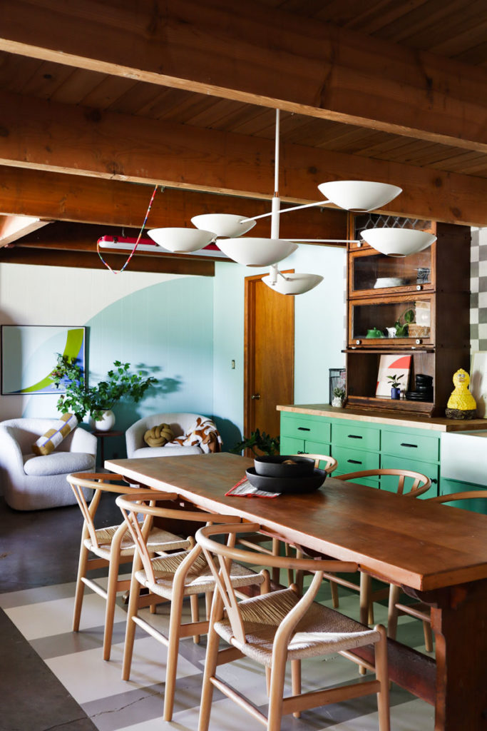
It is so good! The arms of the piece are posable so I enjoyed swinging them into different positions to make it look its best for the space. It’s such a beautiful piece and it really elevates the room. One of my favorite things to do is to combine DIY and budget decor with quality and more expensive pieces. I highly recommend this strategy for stretching your budget.
I have so much respect when I see an expensive couch in a room next to a DIY sculpture or mural. Express yourself and spend money on the things you want to really wow people.
Hutch
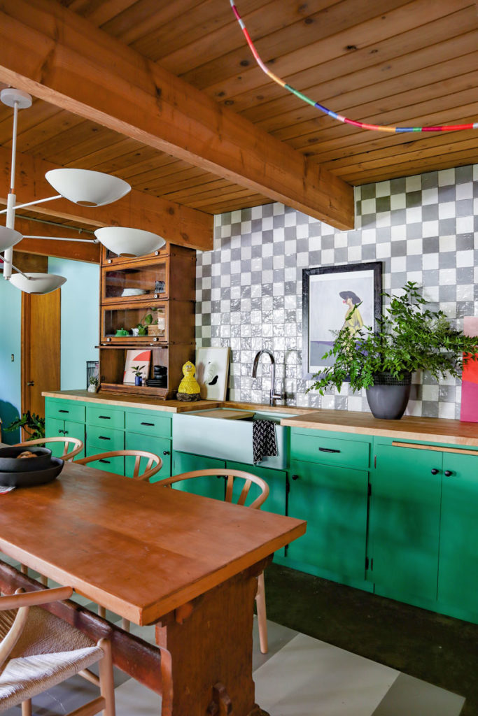
One of the things I really wanted to work into the space was an antique piece of furniture. This hutch has been in our family for a while. It’s a gorgeous piece with stunning glass work on the top section. I’ve been gushing over it for a long time. I really wanted to use it to add some nice elevation to the kitchen. I felt like the left side of the countertops needed to have some thing to break things up visually.
Well, I measured everything and it was a perfect fit. So after we got the tile in, Garrett and I lifted it up into place.
And then, everything just fell apart. I totally forgot to factor in the countertops into the height of the hutch! I was completely devastated. No, like really devastated. There was a moment when I was questioning the months of work I’ve put into this room just because this was so crucial to me.
But that’s when you roll with the punches. This may have been a super gut punch when I wasn’t expecting it from a heavy-weight champ, but you’ve got to get back up.
That’s when I realized, if I trimmed the top and the bottom of the hutch slightly, it could just slip into place. I didn’t really want to mess up this piece, but it’s where the piece could be valued and really seen for what it is. It’s been hiding in one of our bedrooms in a corner and doesn’t really get noticed. And I will go to my grave fighting for the wallflowers who need to be seen!
I made the cuts. I felt sick to my stomach for a bit. But then we lifted it up and slipped it into its place.
It was the best decision I’ve made! It looks incredible.
It feels kind of old-worldy to have actual furniture in your kitchen. There’s something that feels soulful and ancestral about having this pieces as part of this fun, bold, modern kitchen.
Art
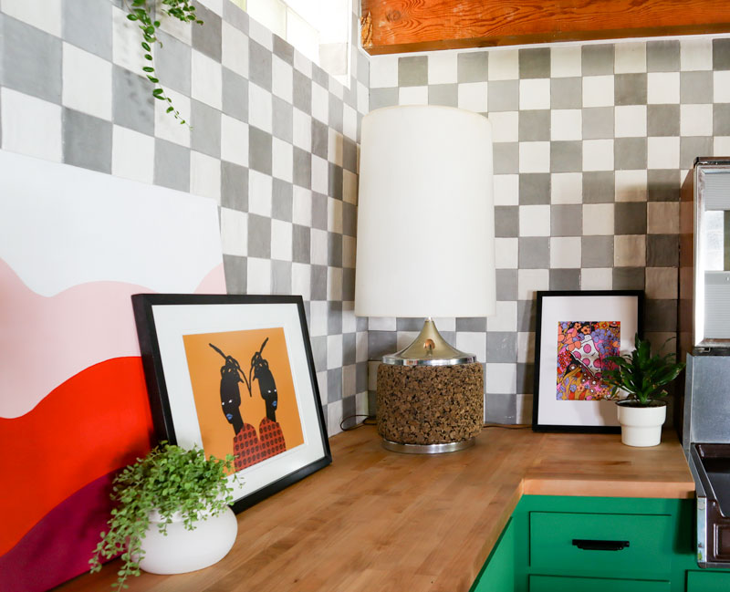
Every space needs art. There are so many pieces that are in this room that I absolutely adore. Please check out the amazing work from each of these artists!
You’ll also see a Banyan Bridges original in the sitting area with the new mural. Oh what’s that? A new mural? Oh yeah, no big deal. Maybe I should explain.
Repainting the Mural
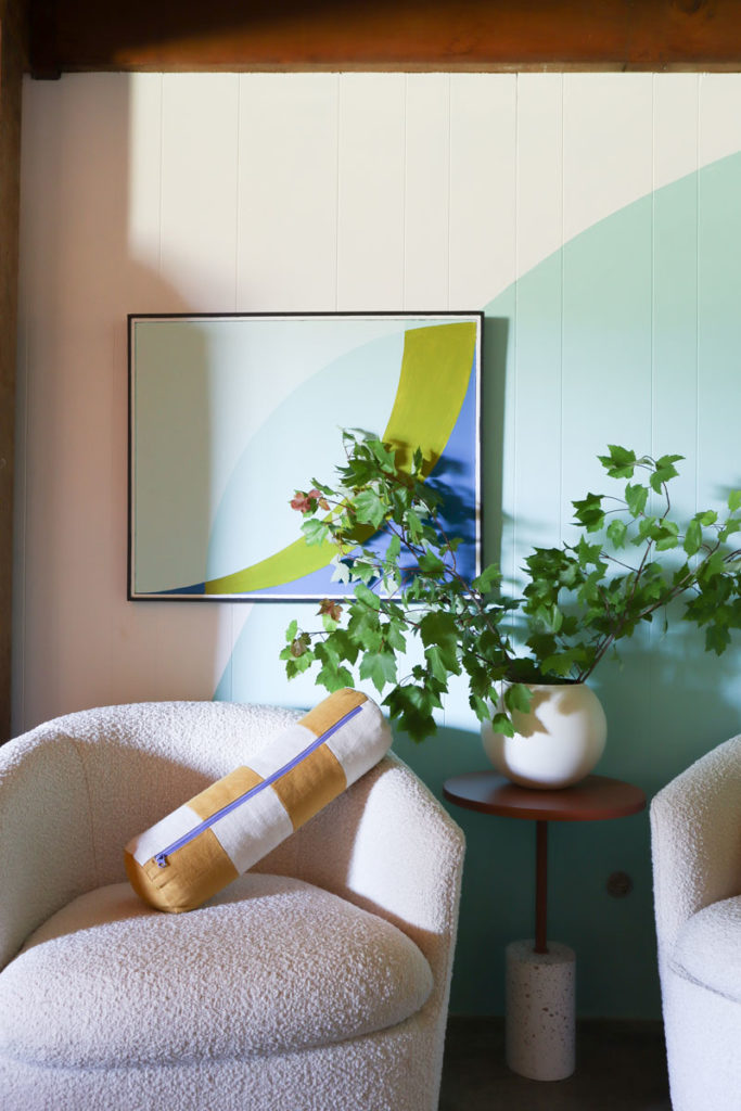
I had to sneak in one last change. I painted a mural for this space, but after completing the kitchen, I realized that it needed to be simpler. I love bold colors and designs, but only when they flow. And flow is a really hard thing to gauge without the space all together. It became clear that the mural was competing and almost had an abrupt line in the space rather than a smooth transition.
I didn’t think I’d have enough time to repaint the mural, but my aunt and cousin showed up late a few nights ago and grabbed a roller and helped me paint over it and install the new mural. This new circle mural simplifies the color story, the flow of shapes, and the way I feel about the room being one space instead of two separate spaces. It’s cute.
Challenge Completed
Thank you for following along with me the last few months with the One Room Challenge! It’s been such a pleasure to watch my colleagues’ work—the other designers have made some incredible things. I couldn’t be more excited about my work too.
This was a space that we hated being in. And now we’ve had dinner the last two nights down here. It may even become our main eating space at this rate. But it’s just a testament to the power of design, grit, and color that can transform something in your home from sucking away life to honoring and encouraging life.
A vision is a powerful thing. I mocked up the below for the space as my dream kitchen—and now it’s a reality.
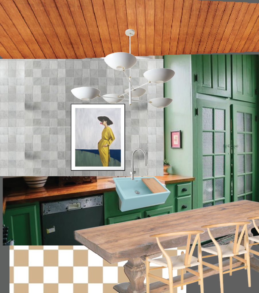
I hope that this encourages you to paint that thing, tear out the cabinet, tackle the project, make your vision a reality.
I believe in you.
See More From the One Room Challenge Creators
I’ll hope you’ll join me and all the other incredible creators and designers that are part of the One Room Challenge!


Ariene C. Bethea | At Home With Ashley | Banyan Bridges | Bari J. Ackerman | Brit Arnesen
Brownstone Boys| Cass Makes Home | Dominique Gebru | Gray Space Interiors| Haneen’s Haven
Home Ec. | Nile Johnson Design | Pennies for a fortune | Prepford Wife | Rachel Moriarty Interiors
Sachi Lord | Susan Hill Interior Design | This Is Simplicite | Tiffany DeLangie | Victoria Lee Jones
Media BH&G | TM ORC


I’m sure you’ll be told 1000 times today but this very sincerely is just beautiful. I love the coziness it brings along with the style punches. Anyone can do amazing things with 12 foot ceilings and tons of light but this basement is a true testament to YOU. 👏👏
Amazing. Congratulations! 💚
Awesome job!!! I seriously love it so much.
So good. Your quirky use of color, scale, new, old, and unexpected pieces gives me breath and inspiration.
Absolutely beautiful! So cozy and inviting, I love it!
Absolutely Stunnig Rachel! Love it! 🙌🏼🙌🏼
Amazing! That mint sink is truely a thing of beauty. I can’t believe the transformation. You’re a wizard!
Fabulous!!! Thank you for taking us along for the ride… so fun, whimsical and inviting—the entire space is a work of art!!!
It’s incredible! Love all the thoughtful, whimsical design decisions and the way you write about your work is a joy.
Love your style and authenticity! It shines through your work and is the reason I keep coming back to you for inspiration. Congratulations on a beautiful project!
Absolutely fun and fabulous! 🌈
There are literally no words for how much I LOVE this space! It’s incredible and that hutch is the icing on the very beautiful cake. It HAD TO BE IN HERE! I’m so so glad you could make it work!
Beautiful and full of personality! Is this your primary kitchen now?
Did I miss the part where you talked about the light over by the oven? It kinda looks like the terrible original light, but updated to be fabulous? Is that embroidery thread wrapped around the power cord? I am all kinds of curious here!!
yes! that is so cool. and the original microwave? It must be attached to the cooktop?? Love the look.
Love every single detail. Every. Detail.
Congrats on a great job!
You always blow me away with your cool and unique design!! You are a breath of fresh air! And a hot to watch in the process. Thanks for sharing!
It is INCREDIBLE!!! So full of energy and life!! I just love it!
Racheal, It’s just beautiful and perfect. It’s a joy to follow you.
What color is the paint?
Yes, please someone what is that gorgeous green color? It’s so bright and perfectly leans just a little blue.
It’s Lucky Green by Sherwin Williams. I love it!
So good! Amazing transformation. You must just love hanging out in there now.